View
Drag

Bob Redmond Auto Collision faced the challenge of an outdated brand image and website that no longer fully reflected their level of professionalism, quality of service, or growth over time. An older or less polished online presence has made it harder to attract new customers, especially younger audiences who expect modern, trustworthy digital experiences, while also risking the loss of connection with their long-time loyal client base.
The goal was to refresh Bob Redmond Auto Collision’s brand identity and modernize their website while preserving the family-oriented feel. The website needed to convey professionalism, showcase their services, and update their messaging to appeal to both new and loyal customers.
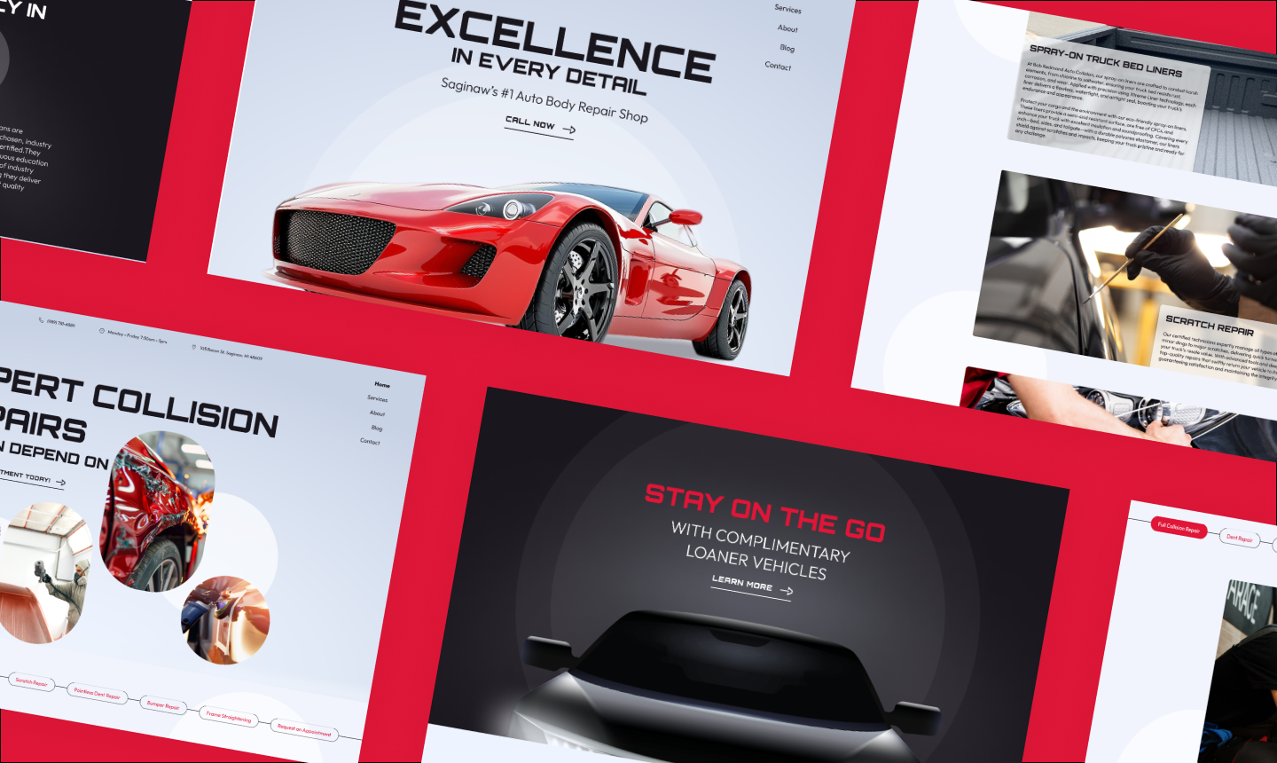
We began by creating logo and website mood boards to define the ideal fonts, color schemes, and brand direction. After finalizing the logo and color scheme, we designed initial website mockups in Figma, refined them with responsive adjustments, and exported the site to HTML. From there, we completed the development in WordPress.
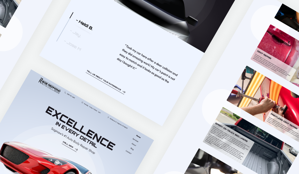
We designed the initial mockups and responsive adjustments for Bob Redmond Auto Collision’s website using Figma to ensure a visually cohesive and user-friendly layout. The approved designs were exported to HTML for a smooth transition into development. Finally, the site was built in WordPress, providing a completely custom backend that allows the client to easily manage and update content as needed, ensuring longevity and ease of maintenance for their digital presence.

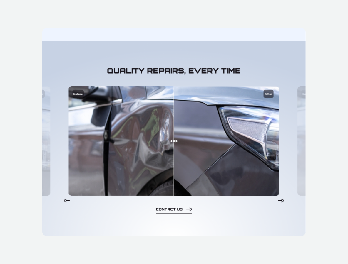
An engaging slider that allows users to see the transformation of vehicles with side-by-side before and after images, showcasing the quality of repairs.
A dynamic sub-navigation for the services section, enabling users to quickly access detailed explanations for each service provided.
A mobile-friendly design that ensures the site delivers a seamless experience on all devices, from desktops to smartphones.
We refreshed Bob Redmond Auto Collision’s brand identity with a new logo and color scheme, preserving their family-oriented feel while adding a modern touch. The website’s user-centric design makes navigation easy, with interactive features like a before vs. after slider and detailed service descriptions to engage visitors. Built on WordPress, the custom backend allows for effortless updates, giving the client flexibility to keep content current as their business grows.
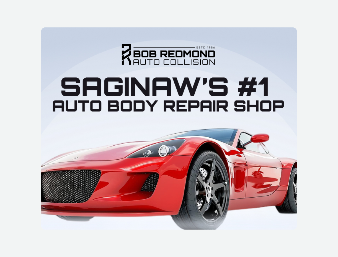
A new logo and color scheme aligned with the company’s values, modernizing the look while preserving the familiar, family-friendly feel.
An easy-to-navigate website with clear service descriptions, helping users find what they need without hassle.
Developed in WordPress, allowing the client to easily manage content, update services, and keep the website fresh and relevant.