View
Drag


You don't get a second chance at a first impression. And online? You don't even get five full seconds.
Before a visitor reads your headline, before they scroll, before they consciously think anything at all, your homepage has already told them a story. Not with paragraphs or clever copy, but with structure, spacing, visual hierarchy and clarity.
The first impression your site creates comes before anything else, and answers the only question that matters:
"Can I trust this business with my time, attention or money?"
If your homepage isn't engineered for that moment, it doesn't matter how brilliant your content is. They'll never stay long enough to read it.
Before a single word is read, your visitors are assessing three things:
When someone lands on your site, their eyes don't wander; they scan.
If your page has:
Competing headlines
Cluttered sections
Too many CTAs
No breathing room
You're sending a silent signal:
"We don't know what matters most."
Strong brands feel structured. They make decisions easy. If your homepage forces visitors to figure things out, they won't.
Your visitor should be able to answer instantly:
Who is this for?
What problem do they solve?
Why should I care?
Not after scrolling. Not after clicking. Immediately.
If your hero section reads like:
"We offer innovative solutions for modern businesses"
"Your trusted partner in digital excellence"
You're not speaking, you're hiding.
Clarity beats creativity every time.
Your color choices, typography, spacing and imagery combine into one emotional verdict:
Premium or budget?
Strategic or chaotic?
Established or brand-new?
This isn't about design trends. It's about perceived value.
If your site feels generic, your offer becomes generic. No matter how good your service is.

Homepages don't fail because of bad design. They fail because of unclear positioning.
The results?
Too many messages
Too many audiences
Too many priorities
Your homepage tries to talk to everyone and ends up connecting with no one.
This is the same gap seen in many marketing breakdowns: traffic without a clear conversion path doesn't just underperform, it actively drains resources.
Your homepage is either reinforcing your strategy or quietly sabotaging it.
A strong homepage doesn't try to sell, it does these three things extremely well:
Your homepage should feel like the end of the search, not the beginning. Visitors should immediately know:
You are credible.
You understand their problem.
You have the experience to deliver results.
Think testimonials above the fold, clear branding and concise proof points; these aren't decoration, they're trust signals.
A high-performing homepage repels the wrong visitors and attracts the right ones. Clear positioning and targeted messaging answer:
Who is this for?
Who isn't it for?
Why should the right visitor stick around?
A homepage that tries to appeal to everyone ends up resonating with no one. Define your audience and let your site do the qualifying for you.
Momentum isn't built at launch, it's built through clarity, direction and thoughtful next steps. Every element on the page should guide visitors to a meaningful action, whether that's:
Booking a call
Downloading a resource
Signing up for a newsletter
The goal isn't "learn more." It's a strategic step forward that moves your ideal visitor closer to conversion.
Right now, your site is already having a conversation with your visitors. The only question is whether it's closing the deal or costing you opportunities you didn't even know existed. If your homepage is still shouting generic statements, it's not a business asset, it's a liability.
At Hierographx, we offer website design services that work for you: we clarify your message, guide the right visitors and create momentum that turns first impressions into measurable results. Every homepage we build is engineered to communicate value, establish credibility and grow alongside your business.
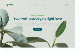
Captivate your audience and enhance brand perception with our custom website design services, creating an unforgettable digital experience.

Captivate your audience and enhance brand perception with our custom website design services, creating an unforgettable digital experience.


