View
Drag

Human Hoist

Elevating Human Hoist

Services
Branding
Industry
Industrial
Platfrom
Website

Human Hoist is a leader in ergonomic solutions, dedicated to supporting industrial and demanding work environments with innovative mobile positioning tools. Their mission is to reduce physical strain while promoting safety, comfort, and productivity for their users.

Challenge

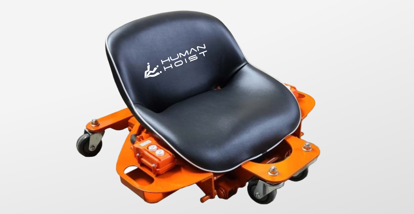
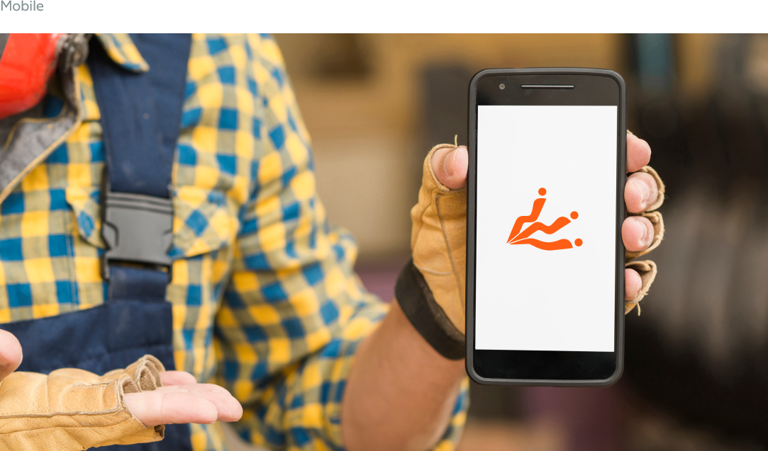
Human Hoist approached us with an established logo that featured an overly detailed icon, making it difficult to scale and modernize across various platforms. The challenge was to simplify the icon while maintaining its core essence and aligning it with the company’s mission and product offerings.

Goals

  • Simplify the existing logo icon to improve scalability and modern appeal.
  • Retain the original logo font for brand consistency.
  • Create a visual representation of their flagship product, the Human Hoist Chair, in the logo design.
  • Develop a cohesive brand identity that reflects innovation, safety, and industrial strength.

Brand Elements

- A simplified, modern icon that showcases the ergonomic capabilities of the Human Hoist Chair in three essential positions. - The bold Construction Orange (#FF5F15) complements the industrial focus of Human Hoist, creating a powerful, standout brand.

Ready to modernize your company’s logo? Hierographx specializes in crafting innovative brand identities

Learn More icon

Discover more how Hierographx has reimagined brands in industrial and medical industries

case study image
Icon of an arrow pointing upwards
View case study
Branding
Leadership Development
Website

Empowering Leadership Through Bold Branding

Explore More On These

Branding
Industrial
Website